|
|


 10-17-2003, 07:21 PM
|
#1 |
|
Member
Join Date: Jul 2003
Posts: 608
 |
 Its supposed to be a reference to the the constellation Taurus. The red star is a reference to Aldebaran, the brightest star in the constellation. If you ask me..........there ugly. Too much like the Minny' Wild colors. The Stars already left Minnesota, they dont need to copy them. And that bright red does not mix well, either.
__________________

|

|

|
| Sponsored Links |
|
10-17-2003, 07:31 PM
|
#2 |
|
Diamond Member
Join Date: Feb 2001
Posts: 7,673
 |
i always thought they should have changed their name from the "North Stars" to the "Lone Stars"
yeah, yeah, yeah... i know you can't have "Lone" and the plural of star at the same time. it's kind of an oxymoron... but it sounds cool.
__________________
|
|
|
|
|
10-17-2003, 07:48 PM
|
#3 |
|
Diamond Member
Join Date: Jul 2002
Posts: 3,460
|
I hate em. They look minor league.
|
|
|
|
|
10-17-2003, 09:38 PM
|
#4 |
|
Platinum Member
Join Date: Jan 2002
Posts: 2,511
|
No kidding, that is the best they could do. Maybe it is time for Hicks to get some new marketing people.
|
|
|
|
|
10-17-2003, 11:39 PM
|
#5 |
|
Platinum Member
Join Date: May 2003
Location: Irving,TX
Posts: 2,032
|
Are we talking about the DALLAS Stars? That is way different, different colors and logos and everything. I don't think I'll be able to get used to those.
|
|
|
|
|
10-17-2003, 11:42 PM
|
#6 |
|
moderately impressed
Join Date: May 2003
Location: Home of the thirteenth colony
Posts: 17,705
|
That thing is so freaking ugly....
Not sure what they were thinking. Pathetic.
__________________

|
|
|
|
|
10-18-2003, 12:10 AM
|
#7 |
|
Member
Join Date: Jun 2003
Posts: 298
|
A sad attempt by Tom Hicks to make up money he lost on the Rangers.
__________________
Kid: What are you going to do today Napoleon? Napolean: Whatever I feel like! God! |
|
|
|
|
10-18-2003, 01:09 AM
|
#8 |
|
Diamond Member
Join Date: Jan 2003
Location: Los Angeles, CA
Posts: 3,947
|
I don't like it, but there are worse third jerseys out there, & like Morrow said, they won in them so now they're "lucky." They do look better on. Hate, hate, hate the red.
__________________
Let's Go Mavs! Leht's Go Stars! |
|
|
|
|
10-18-2003, 02:09 AM
|
#9 |
|
Golden Member
Join Date: Mar 2001
Location: Deep Ellum
Posts: 1,260
|
If it ain't broke don't fix it!
That jersey is Broke! It does look minor league.
__________________
"You can run me, you can starve me, you can beat me, and you can kill me; just don't bore me." -Gunny Highway |
|
|
|
|
10-18-2003, 10:19 AM
|
#10 |
|
Banned
Join Date: Feb 2002
Location: Nowhere
Posts: 40,924
 |
That jersey is unfortunate. P.U.
|
|
|
|
|
10-18-2003, 01:36 PM
|
#11 |
|
Member
Join Date: Jul 2003
Posts: 608
|
Oh come now.............its not THAT bad The concept of the idea was new and fresh. No team in sports has ever used a constellation as a logo. But this is still really ugly............ But it could have been done much better.......here are things that I feel went wrong here. 1............You have already left Minesota long ago. Why on earth copy off of there new team? To remind the people of Minesota where the Stars used to be maybe. C'mon people. Like its quoted in an Eagles song, "If your mama's to skinny and your daddy's to fat, GET OVER IT!" Red should have had no part in this. Its has never been a color in the team color scheme. And in fact, its not on the current logo and other uniforms either. It just came out of no-where. Strange. And besides, Green, Gold and Black looks very professional and beautiful. Why ruin it with this bright ketchup red? Eeeck!!!!!!! 2............And as if copying off of Minnesota wasnt enough, The Stars Marketing department apparently got confused as to where they were located, Dallas or Houston? Why on earth are they using a SPACE THEME for a Dallas team? Dallas isnt known for space exploration or NASA. Leave all of that "spacey" crap to Houston, Space City USA. You people in Dallas should be mighty pissed about this. For this does not correctly represent the city of Dallas in any way. They should have gone for what Dallas is known internationally for, its rich country-western heritage. That's more you Dallas. Its works and fits well for every other team in Dallas, Cowboys, Rangers, Mavericks etc..........just as it does for Phoenix (Desert theme) Houston (Space theme) Boston, Philly, Washington (Patriotic theme) etc........ Personally, I think the Stars should have used an old-west sherrifs badge for there logo like the Rangers old logo. It has a "STAR" on it and easily and safely links this logo and team name, not to mention, better represents the city of Dallas then what they came up with. And it looks classy and professional............  But its not to late for you Stars fans. Remember, we Isles fans had to deal with that horrible "Fisherman" logo and theme a few years back. But then, we decided to throw a revolt against the team for that disgracefull move, and finally the team reverted back to its traditional "Long Island" look. Ahh..........the power of the fans. Maybe it can work for you too.............good luck.
__________________
|
|
|
|
|
10-18-2003, 01:43 PM
|
#12 |
|
Member
Join Date: Jul 2003
Posts: 608
|
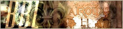
here's another pic...............
 And here are other new thirds to debut this year.............. Wild.......  Blue Jackets............Of Ohio state flag wrapped around a star in the shape of a "C"  By far........the Blue Jackets have the best looking new sweater in the league.............
__________________
|
|
|
|
|
10-18-2003, 03:23 PM
|
#13 |
|
Diamond Member
Join Date: Jan 2003
Location: Los Angeles, CA
Posts: 3,947
|
You know whose new ones I like? Calgary. Columbus's are pretty nice too. The new Ducks & Coyotes jerseys are improvements b/c it is almost impossible for them not to be.
After watching the game on tape, I've decided I don't really mind the new jerseys, it's the logo I hate. But you know what, if they keep winning in them, I'll love them. They look really good when the Stars are celebrating a goal.
__________________
Let's Go Mavs! Leht's Go Stars! |
|
|
|
 |
«
Previous Thread
|
Next Thread
»
 Linear Mode

|
|

All times are GMT -5. The time now is 07:56 PM.